Interactive notebooks
June 11, 2019
Context
I often find myself in a situation where I have some parameters that are usually written in a single cell at the begining of a notebook and that I have to manually change and then re-run the notebook in order to see changes. But we can actually use a more natural way of changing parameters using select HTML elements or sliders for instance. Let’s see an example.
Tools
We will use pandas and numpy to generate some data, matplotlib for plotting. We also need to install ipywidgets extension. If using jupyterlab, you can read this link to enable the extension in this context (something like jupyter labextension install @jupyter-widgets/jupyterlab-manager)
%matplotlib inline
import matplotlib.pyplot as plt

import numpy as np
import pandas as pd

from ipywidgets import interact
Sample data
So, let’s generate some sample data. For this exercice, we will generate a dataframe with four columns, each column containing a random variable normally distributed with different mu and sigma. The goal is to be able to select a column and show the distribution of this variable.
Here is how I generate some random data:
PARAMS = {
	# mu, sigma
    "A": (0, 1),
    "B": (1, 1),
    "C": [0, 2],
    "D": [0, 0.5]
}

data = pd.DataFrame(columns=list(PARAMS.keys()))

for c, (mu, sigma) in PARAMS.items():
    data.loc[:,c] = np.random.normal(mu, sigma, size=1000)

data.head()
The main function
In the old days, I would have done something like this:
name = "A"
d = data[name]
plt.hist(d, bins=20, range=(-5, 5), alpha=0.7)
plt.xlabel("x")
plt.ylabel("y")
plt.title(f"Gaussian {name} $\Rightarrow \mu={PARAMS[name][0]}$, $\sigma={PARAMS[name][1]}$")
plt.show()
Now, I could not live anymore without;
@interact
def plot(name=list(data.columns)):
    d = data[name]
    plt.hist(d, bins=20, range=(-5, 5), alpha=0.7)
    plt.xlabel("x")
    plt.ylabel("y")
    plt.title(f"Gaussian {name} $\Rightarrow \mu={PARAMS[name][0]}$, $\sigma={PARAMS[name][1]}$")
    plt.show()
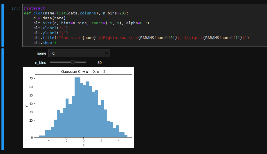
Which can configured even further, for instance:
@interact
def plot(name=list(data.columns), n_bins=20):
    d = data[name]
    plt.hist(d, bins=n_bins, range=(-5, 5), alpha=0.7)
    plt.xlabel("x")
    plt.ylabel("y")
    plt.title(f"Gaussian {name} $\Rightarrow \mu={PARAMS[name][0]}$, $\sigma={PARAMS[name][1]}$")
    plt.show()